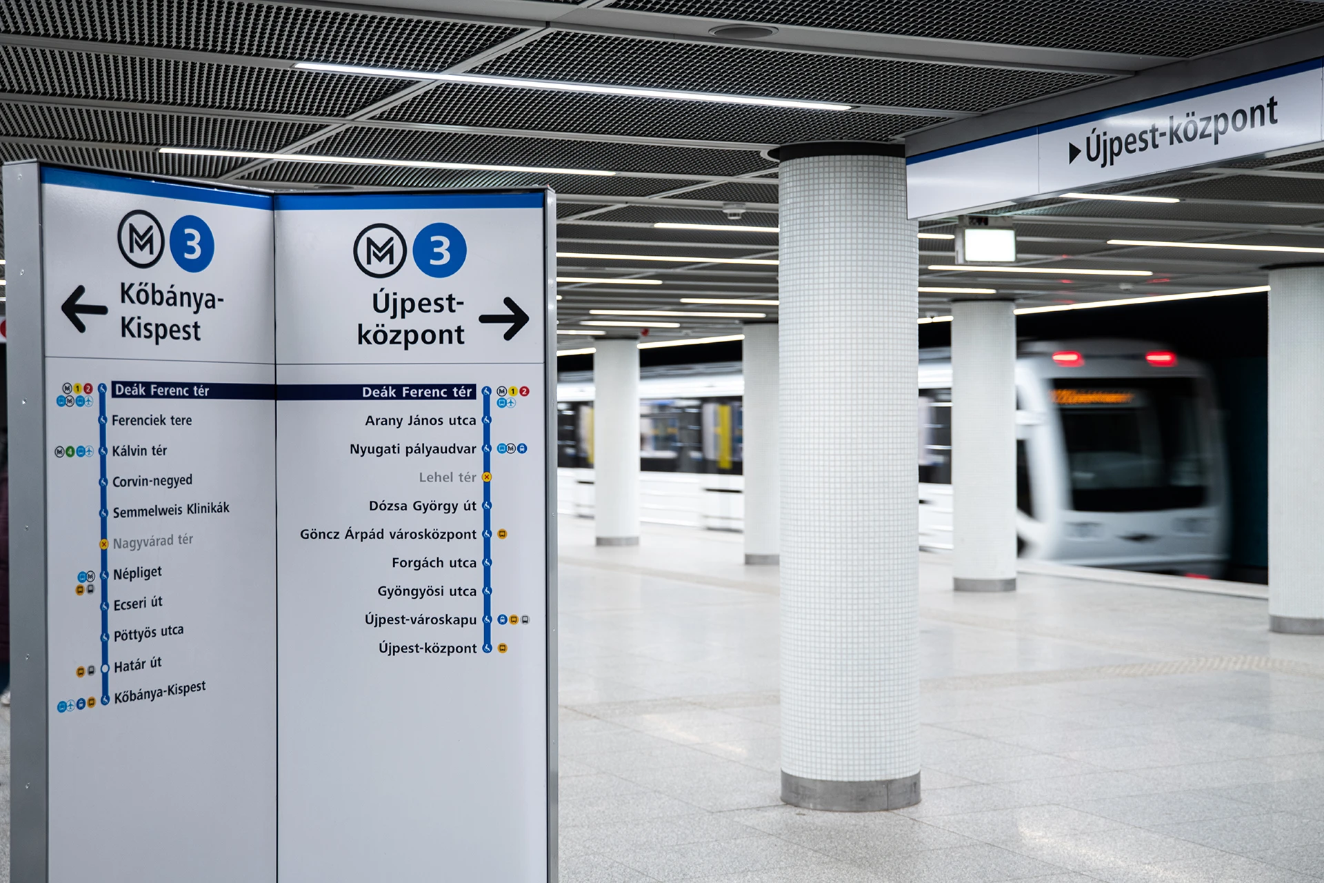
Means of public transport along with passenger information systems form an integral part of cityscapes around the world and they are all becoming easily recognisable symbols of major metropolises, from London to Paris to New York and beyond. The sky-blue buses, yellow trams and the design of public transport information systems are also defining elements of Budapest's image.

In Budapest, the trams, buses, trolleybuses and one of our World Heritage treasures, the “Millennium Underground”, are as much a part of the city's identity and memorable sights for residents and tourists just as Buda Castle, the Chain Bridge and Heroes' Square. The appearance and signage of the stations, stops and pedestrian underpasses has a major impact on the perception of the city, mainly in terms of providing accurate information, but also in terms of aesthetics.
Therefore, it is crucial not only for BKK, but also for the overall image of Budapest, to present public transport in a sophisticated way and to build an information and wayfinding system that is easy to use for everyone.
The purpose of good branding
An important task of corporate identity is to have a consistent and high-quality image that is recognisable, understandable and distinctive. Identifiability of BKK is a primary aspect for all corporate identity elements, and all of them are designed with a specific purpose and function. When designing them, we must take into account not only the uniform appearance of the company, but also information-related and psychological aspects, social expectations, habits and knowledge, among other things.
The main task of design is to find the best solution to a need, a function, under predefined conditions. When designing, it is not enough to focus only on visual aspects. In order to create useful and optimal solutions for everyone who is on the move in the Hungarian capital, it is essential to incorporate our clients' expectations into the process. Our aim is to design and implement signage and markings that make journeys easier.
Logo
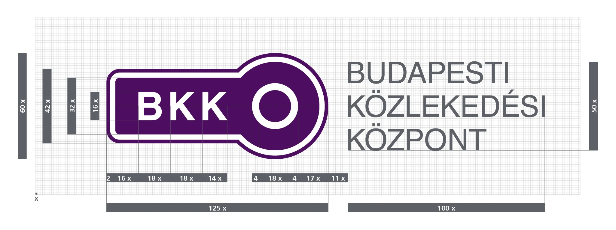
The logo of BKK Centre for Budapest Transport is not only a symbol of the company, but also an integral part of the unified image of a larger system - transport. That is why, when we created it, we wanted it to be simple, easily recognisable, clearly linked to transport and logical, but also able to represent the different sectors of transport. The City of Budapest and BKK logos appear together on many surfaces.
Colours
The most important colour of BKK is dark purple, which is not only the primary colour of the logo, but also a must-have element of our sales and passenger information systems, the website and the uniforms worn by staff. This colour does not only give a uniform look, but it also makes it easier to identify customer service centres, ticket offices and ticket vending machines (TVMs).
In addition to purple, we use a number of other colours that play an important role: they provide a visual aid to distinguish between different types of transport services. The colour-coding is so widely known that even young children are aware of its meaning: in street-level transport
In order to better distinguish the suburban railway (HÉV) lines from each other, we use different colours for the H5, H6, H7, H8 and H9 lines, similar to the colouring of the metro lines.
Partly for easier orientation, partly for differentiation, BKK marks the metro lines in different colours:
- yellow is used for metro line M1
- red for metro line M2
- blue for metro line M3
- the colour green is used for metro line M4
Shapes and forms
The circle is the basis for the different transport sectors, pictograms, symbols and arrows in the Budapest transport system.
Rectangles are used to separate logical units, such as text or figures, and for highlighting.
BudapestGO
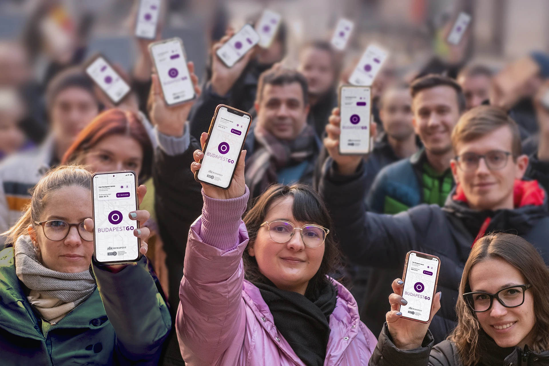
When designing the BudapestGO app, your digital companion, we considered it important that the journey-planning and ticketing app displays information in colours and shapes that match the BKK brand identity. We display the transport lines, stops, ticket vending machines and routes in a clear and transparent interface that can also be used in dark mode. We are working to make your mobility easier and more convenient, both visually and functionally.


